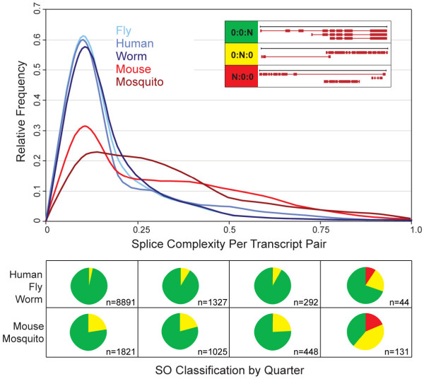
Figure 5.
Genome-wide Splice Complexities and SO classifications of alternatively spliced annotations. The upper panel shows the frequency distribution of Splice Complexities per transcript-pair. The x-axis: Splice Complexity; the y-axis: relative frequency. The annotations were then broken into four bins based upon their Splice Complexities: 0.0–0.25, >0.25–0.50, > 0.5–0.75, >0.75–1.0. The contents of each bin were then classified using the SO schema, with the boxes in lower part of the Figure corresponded to the quadrants of the graph above. Each pie chart shows the relative frequency of three different SO-classes for the annotations in that bin: green:0:0:N genes, yellow:0:N:0 genes, red:N:0:0 genes (The insert in top panel provides pictorial summary of the typical splicing patterns associated with these SO classes). The numbers associated with each pie chart represent the total number of annotations in that bin. Pie charts shown in the top-half of the lower panel give the combined breakdown for H. sapiens, D. melanogaster and C. elegans annotations; the bottom-half shows data for the combined M. musculus and A. gambiae annotations.

