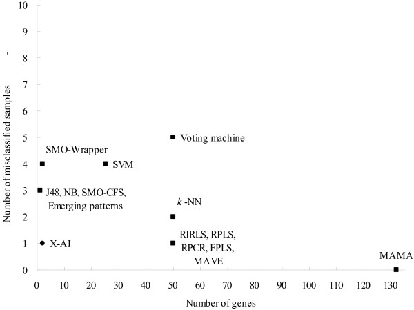
Figure 4.
Comparison of prediction performance between different methods. The y-axis denotes the number of samples which were misclassified by those methods on the test set of L1. The number of used genes is represented in the x-axis. Voting machine [1] SVM [31] Emerging patterns [32] MAMA [33] J48, NB, SMO-CFS, SMO-Wrapper [30] RIRLS, RPLS, RPCR, FPLS, MAVE, k-NN [34]

