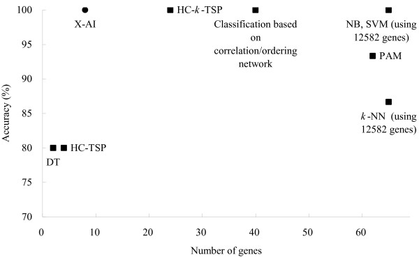
Figure 5.
Comparison of prediction performance between different methods. The y-axis denotes the number of samples which were misclassified by those methods on the test set L2. The number of used genes is represented in the x-axis. Classification based on correlation/ordering network [35] HC-TSP, HC-k-TSP, DT, NB, k-NN, SVM, PAM [19]

