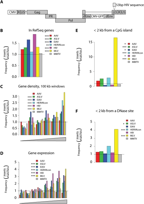
Figure 1.
Integration target site selection of HERVKcon compared with other retroviruses. (A) Diagram of the modified HERVKcon used for integration targeting studies showing the insertion of a DNA tag in the U3 region of the 3′ LTR. For B–F, values are reported as the proportion of integration events divided by random events. The bar at 1.0 represents the expected random distribution. The statistical significance of differences from the matched random controls is shown by the asterisks next to the legends. (*) 0.05 > P > 0.01; (**) 0.01 > P > 0.001; (***) P < 0.001. (B) Integration frequency within RefSeq genes. (C) Integration frequency as a function of gene density. The X-axis shows six bins of increasing gene density from lowest (left) to highest (right). (D) Integration frequency relative to gene expression. All genes tested in 293T cells using the Affymetrix 133 array were divided into eight equal bins, then the proportions of integration sites in genes at each activity level were quantified and compared with random. The X-axis shows bins of increasing expression rank from lowest (left) to highest (right). (E) Integration frequency relative to CpG islands, scored as the proportion of integration sites within 2 kb of an annotated CpG island. (F) Integration frequency relative to sites of DNase I cleavage (Crawford et al. 2004), scored as the proportion of integration sites within 2 kb of an annotated cleavage site.

