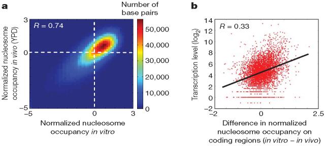
Figure 2. In vitro and in vivo maps are highly similar.
a, Shown is a density dot plot comparison of the normalized nucleosome occupancy per base pair in the in vitro (x axis) and in vivo (y axis) maps (see Methods). Values above zero indicate nucleosome enrichment relative to the genome-wide average. The colour of each point represents the number of base pairs that map to that point in the graph. The Pearson correlation between the maps is indicated. b, Nucleosome depletion in vivo relative to in vitro over coding regions increases with the expression level of associated genes. Shown is a dot plot comparison between the expression level of every yeast gene (measured in ref. 26) and the difference between the average normalized nucleosome occupancy of the coding region of that gene in the in vitro map compared with the in vivo map (that is, higher values indicate larger nucleosome depletion in vivo relative to in vitro). The Pearson correlation of the dot plot is indicated.

