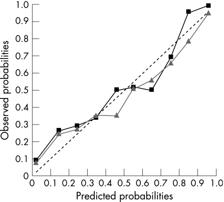
Figure 4 The calibration curve with observed probabilities (frequencies) of pulmonary embolism events plotted against predicted probabilities of the same event. Data are grouped into deciles according to the predicted probabilities. The dotted line represents perfect calibration, whereas the green (with triangles) and the blue (with squares) curves, respectively, refer to the training and validation samples.

An official website of the United States government
Here's how you know
Official websites use .gov
A
.gov website belongs to an official
government organization in the United States.
Secure .gov websites use HTTPS
A lock (
) or https:// means you've safely
connected to the .gov website. Share sensitive
information only on official, secure websites.
