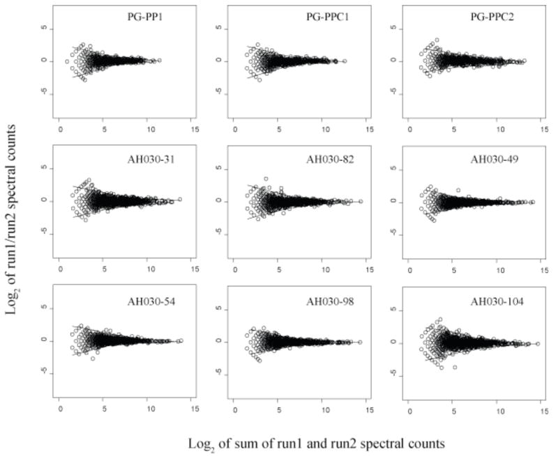
Figure 2.
Scatter plots of protein abundance ratio versus total counts for technical replicates, log2 of spectral count ratios versus log2 of the total spectral counts from both technical replicates for nine biological samples. The two solid curves shown above and below the zero axis in each plot are the LOWESS smoothing curves [33] fit to the upper and lower boundaries of the random scatter about an abundance change of zero. The LOWESS curves shown for PG_PPC1 and PG_PPC2 were used to indicate the regions of random error in Fig. 3. PG_PP1 is the internalized biological replicate used for the abundance ratio calculations along with the two external controls, PG_PPC1 and PG_PPC2 (see text). The remaining plots are from nutrient limitation studies of the methanogenic Archaeon Methanococcus maripaludis. These plots serve as a useful graphical overview of the quantitative reproducibility of protein abundance ratios determined by spectral counting under the experimental conditions described. The similarity of these curves for different organisms under different conditions suggests that the region of random error within the upper and lower boundaries is determined largely by instrumental conditions.

