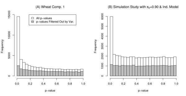
Figure 1.
Histogram of p-values for the Wheat case study and a simulation run. Plot (A) is a histogram of p-values from wheat comparison 1 (using RMA preprocessing). The histogram of the p-values corresponding to the filtered low variance probe sets (lowest 49% variance on the log2 scale) are overlaid in gray. Plot (B) is the histogram of p-values from one run of the simulation (independent case with π0 = 0.90). A histogram of the p-values corresponding to the genes filtered out by variance (lowest 50% variance) are overlaid in gray.

