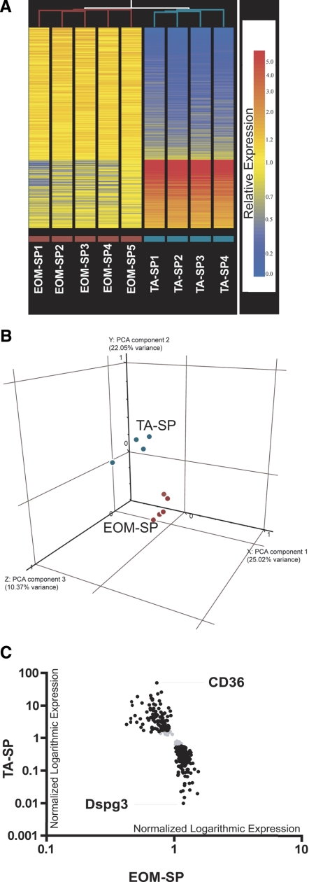
Fig. 2.
Microarray heat map, principal component analysis (PCA), and scatter graph. A: hierarchical clustering analysis of all EOM-SP and TA-SP samples. Unsupervised clustering in Genespring 7.2 version was used to analyze similarities among replicate samples across sorted EOM-SP vs. TA-SP cells. Similarities between samples are indicated by the length of the lines that are at top of each sample column. Relative expression levels of 348 statistically significant transcripts are shown as horizontal colored bars. Red color refers to higher and blue color refers to lower expression as shown on scale bar. Replicate sample names with purple and cyan color codes are indicated at bottom. B: PCA: 3-dimensional plot showing distribution of EOM-SP (red) and TA-SP (cyan) transcripts. The 3 axes correspond to the components with the highest variance between the groups. C: microarray scatter graph of genes differentially expressed between EOM-SP and TA-SP. Black, normalized expression values of 313 transcripts (205 upregulated in EOM and 108 in TA) on a logarithmic scale after a 2-fold cutoff between EOM-SP and TA-SP. Gray, transcripts that did not pass the cutoff. The names of the highest-expressed transcripts in EOM (Dspg3) and TA (CD36) are shown.

