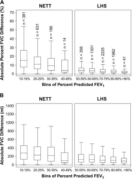
Figure 4.
Box and whisker plots for the percent difference (A) and absolute difference (B) for repeat FVC measurements as a function of FEV1 percent predicted. Boxes represent the IQR bounded by the 25th and 75th percentiles with the bar as the median. The whiskers represent the distribution of values between the upper fence (75th percentile + 1.5 × IQR) and the lower fence (25th percentile – 1.5 × IQR). Outliers are not displayed in the graph. Each bin corresponds to a decile range of percent-predicted FEV1. Example: Bin 1 = 10 to 19.9% predicted FEV1. There are identical numbers of participants (n) in corresponding bins of percent-predicted FEV1 for A and B. Bins for the range of 0 to 9% predicted FEV1 for NETT and 40 to 49% predicted FEV1 for LHS are not displayed as there are fewer than five participants per bin (n = 3 and n = 1, respectively).

