
Figure 3.
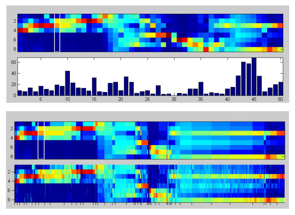
Prototype plot. Two alternative display modes of the prototype plot (region 1a and 1b in figure 2): The first mode (top) corresponds to equally spaced prototype profiles with a cluster size bar plot in the lower part. The second mode (bottom) shows the prototypes spaced according to cluster size (upper box) and the normalized intensity profiles of the respective marker candidates (lower box).