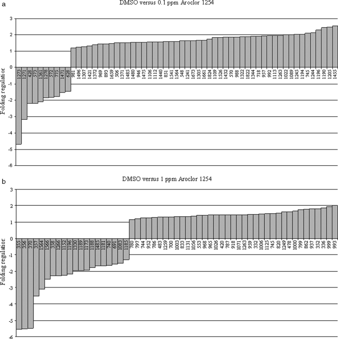
Fig. 4.
Sets of protein spots showing differences in intensity between the PBC experimental groups and the DMSO control group. The y axis represents the -fold change intensity of the protein spots where a positive value indicates an increase in abundance and a negative value indicates a decrease in abundance. Data are organized on the x axis with the down-regulated proteins on the left side and the up-regulated proteins on the right side. a, tadpoles exposed to 0.1 ppm Aroclor 1254 versus control DMSO. b, tadpoles exposed to 1 ppm Aroclor 1254 versus DMSO control group.

