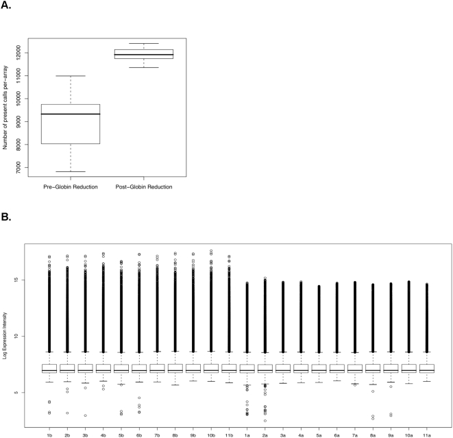
Figure 1. Globin reduction Increased present calls and decreased variance.
Box plots showing the distribution of number of present calls per array in both the pre- and post-globin reduction data. Whiskers on the plots extend from the minimum and maximum values to the lower and upper quartiles, respectively. The box extends from the lower quartile through the upper quartile, with a bold line marking the median. B. Decreased intra-sample variance in intensity by globin reduction. Each column shows the distribution of log expression intensities for one sample as reported in the microarray data. Pre-globin reduction samples are labeled 1b–11b, and post-globin reduction samples are labeled as 1a–11a.

