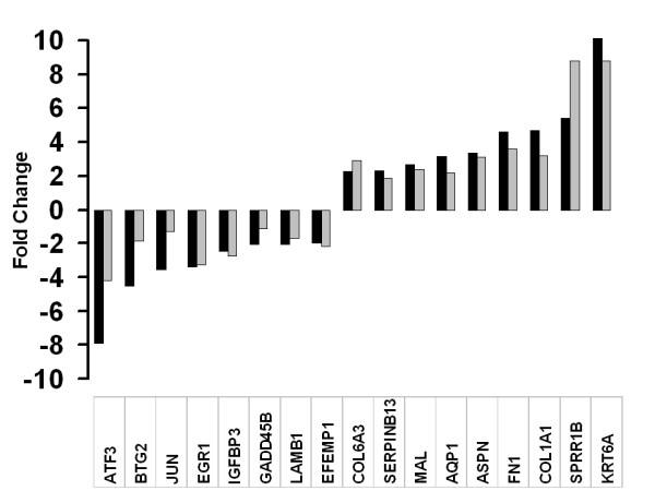
Figure 7.

Validation of microarray data. Bar graph showing the correlation of microarray data with real time PCR transcript levels. Black bars represent number of folds of change by GeneChip experiment, gray bars represent the number of folds of change using real time PCR. A normalised ratio (Y-axis) of more than 1 indicates up-regulation in pterygium, whereas a ratio of less than 1 indicates down-regulation in pterygium. The X axis shows an arbitrarily selected panel of genes.
