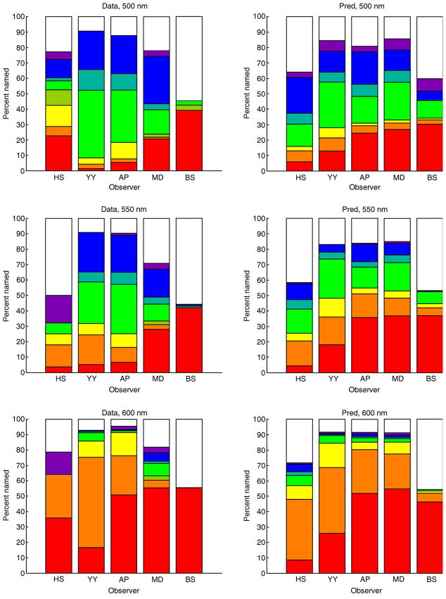
Figure 11.
Prediction of color naming data. Each bar plot shows the percent names for all 5 observers and one wavelength. Left column shows data, while right column shows predictions. Each plot is in the same format as the bottom panel of Figure 2. For plots from top to bottom, wavelengths are 500, 550, and 600 nm, respectively. Within each plot, observers are ordered from left to right HS, YY, AP, MD, and BS.

