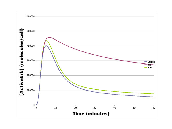
Figure 4.
Simulations of the EGF receptor system. This chart contains simulation traces from various EGF receptor system models. The x-axis represents time in minutes whilst the y-axis represents the concentration of active ERK in molecules/cell. The blue line represents the simulated level of active ERK from the original Brown model, whilst the red line represents simulated active ERK levels with a Rsk knockout, and the green line represents simulated active ERK levels with a P13K knockout. As can be seen, knocking out the PI3K has little effect on active ERK whilst knocking out Rsk has a dramatic effect with the signal switching from a transient to a sustained response.

