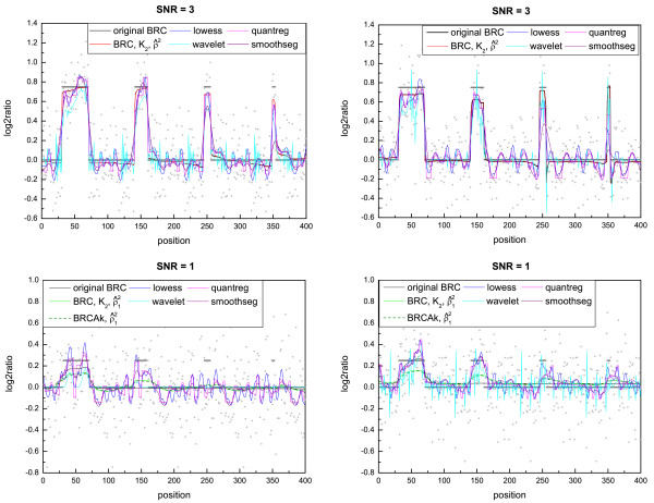
Figure 3.
Example of estimated regression curves. The plots show the differences in the level estimation among the smoothing methods on samples with SNR = 3 and SNR = 1: some oscillate more in the regions outside the aberrations. In cases of high noise, the more oscillating the profiles are, the harder it is to identify which regions correspond to the aberrations. In each graph, the grey segments represent the true profile.

