
Figure 1.
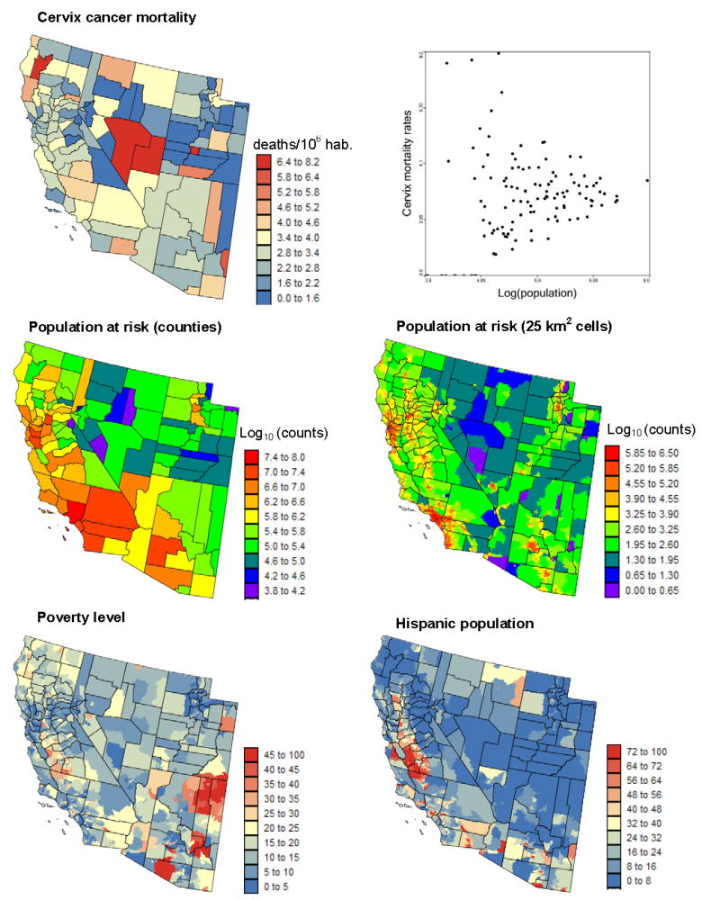
Geographical distribution of cervix cancer mortality rates recorded for white females over the period 1970–1994, and the corresponding population at risk (aggregated within counties or assigned to 25 km2 cells). Scatterplot illustrates the larger variance of rates computed from sparsely populated counties. Bottom maps show two putative risk factors: percentage of habitants living below the federally defined poverty line, and percentage of Hispanic females.