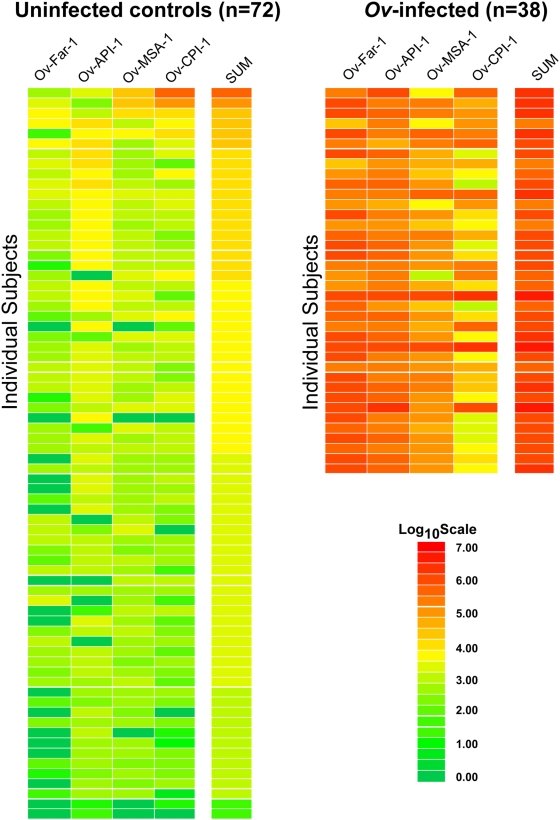
Figure 1. Heat map representation of patient antibody profiles to the 4 Ov antigens.
The antibody levels for each serum were log10 transformed and then the levels were color-coded as indicated by the log10 scale on the left, in which signal intensities range from red to green indicating high (red) and low (green) titers. The samples were rank ordered from highest to lowest based on the sum of the antibody titers to the 4 antigen panel. The samples on the left are from uninfected, while the samples on the right are Ov-infected sera.

