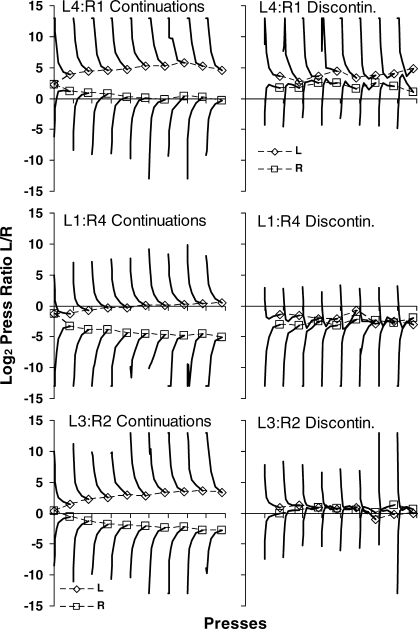
Fig 10.
For the three amount ratios: preference pulses between food deliveries; log (Left/Right) response ratio versus presses across nine food deliveries. Curves were constructed by calculating preference for press 1, presses 2 and 3, presses 4-7, presses 8-15, presses 16-31, presses 32-63, and presses 64-100. The final points of the preference curves are given symbols (squares for the left and diamonds for the right lever) and connected. The left-hand graphs show preference pulses following one to nine continuations, and the right-hand graphs show those following discontinuations after one to eight prior continuations. See text for more details.

