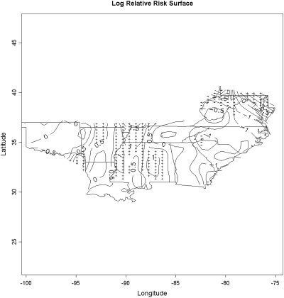
Figure 3.
Map depicts the contiguous states in ESRD Networks 5, 6, 8, and 13. The map displays the natural logarithm of the estimated relative risk surface for having no predialysis nephrology care. Areas marked by “+” indicate areas significantly increased local prevalence of low pre-ESRD care centers and areas marked by “−” indicate significantly decreased local prevalence of low pre-ESRD centers.

