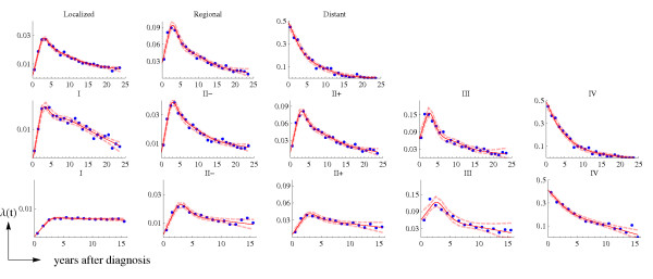
Figure 1.
Stage-specific US hazard rates: observed (dots) and the smoothed function (continuous line). The upper row corresponds to the hazard rates ( ) for the SEER historical stage, period 1975–79 (C1); the middle row corresponds to
  for the AJCC stages, period 1975–79 (C2); and the bottom row corresponds to
  for the AJCC stages, period 1990–2001 (C3). Dashed lines correspond to the 95% point-wise confidence intervals.

