
Figure 5.
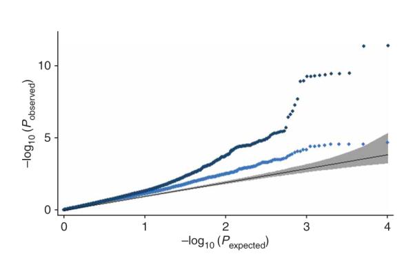
Comparison of results across independent meta-analyses. Quantile-quantile plot for the P values from the accompanying Lettre et al.18 study of the most associated 10,000 SNPs from our study (excluding the DGI component to make the observations independent), including (dark blue dots) and excluding known loci (light blue dots). The black line is the expected line under the null distribution. The gray band represents the 95% concentration bands, which are an approximation to the 95% confidence intervals around the expected line.