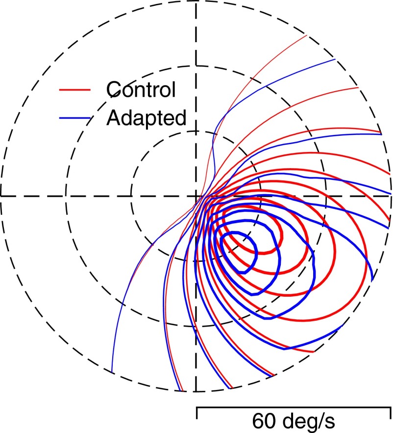
FIG. 9.
Response surface on a polar plot showing the effect of adaptation on the responses of a population of model MT neurons with a wide range of preferred directions and preferred speeds. For this example, the adapting direction was rightward and the testing motion was rotated 30° clockwise from rightward so that it included some downward motion. The red and blue contour lines show the amplitude of the population responses before and after adaptation for model neurons as a function of their preferred direction and speed. Thus each pixel on the contour lines represents the end of a vector whose length is equal to the preferred speed of the model neuron at that pixel and whose angle represents the preferred direction of the model neuron at that pixel. Thicker contour lines indicate larger response values. The model population was based on data from monkey C.

