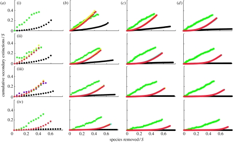
Figure 1.
Secondary extinctions resulting from the primary loss of most-connected species. S refers to species richness and C refers to connectance. The generalized cascade data (yellow circles) and nested hierarchy data (blue circles) are generally obscured by overlapping niche model data (red circles). The cascade data are shown by the upper green circles and the random beta data are shown by the lower black circles that sometimes overlap the lower border of the graph when there are no secondary extinctions. Each data point represents a mean across 500 model webs. Panels are shown in order of increasing connectance ((i) C=0.05, (ii) C=0.10, (iii) C=0.15 and (iv) C=0.30) and increasing species richness ((a) S=25, (b) S=50, (c) S=100 and (d) S=200). Secondary extinction curves end at the point at which approximately 80% of all taxa have gone extinct.

