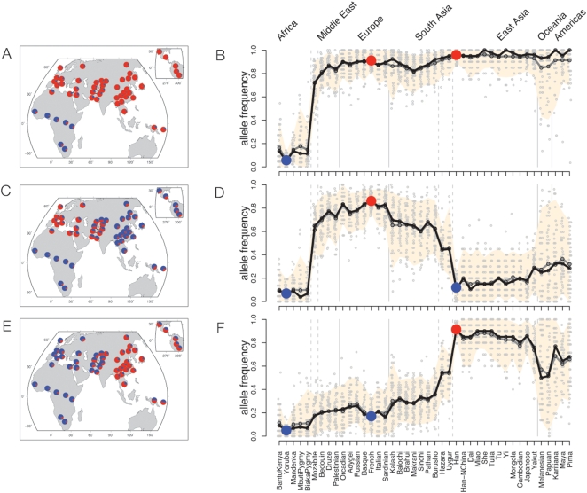
Figure 3. Global allele frequency distributions for SNPs with extreme FST between certain population pairs.
Each row plots frequency distributions for 50 of the most extreme SNPs genome-wide in the following pairs of comparisons: (A, B): SNPs for which Yoruba are highly differentiated from both Han and French; (C, D): French are differentiated from Yoruba and Han; (E, F): Han are differentiated from Yoruba and French. Left column: pie charts of the mean allele frequencies of the 50 highly differentiated SNPs across the HGDP populations; blue and red denote the major and minor alleles in Yoruba, respectively. Right column: The same data are plotted in an expanded format: populations with ≥10 sampled individuals are listed along the x-axis, roughly ordered by geography [40]; vertical grey lines divide the populations based on broad geographic region and dashed grey lines identify populations known to be admixed between broad geographic regions. The y-axis plots allele frequencies in each population; alleles are polarized according to the minor allele in Yoruba. Individual SNP frequencies in each population are shown as grey dots. The mean and median frequencies are shown as gray and black lines, respectively; the peach colored region shows the frequency interval containing the central 94% of the plotted SNP frequencies in each population. SNPs were selected so that each plot includes at most one SNP from clusters of high- FST SNPs (Methods).

