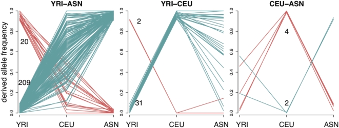
Figure 5. Derived allele frequencies of SNPs with extreme frequency differences between pairs of HapMap populations.
In each plot, each red or blue line indicates the derived allele frequencies of a single SNP in the HapMap YRI, CEU, and ASN population groups. The plots show SNPs with extreme frequency differences (>90%) between each pair of HapMap groups: YRI–ASN (left), YRI–CEU (middle), CEU–ASN (right). The data are for Perlegen Type A SNPs genotyped in HapMap. The red lines show alleles that have high derived frequency in the first population and the upper number on each plot indicates the total number of such SNPs; the blue lines and lower numbers are for alleles that are at high frequency in the second population.

