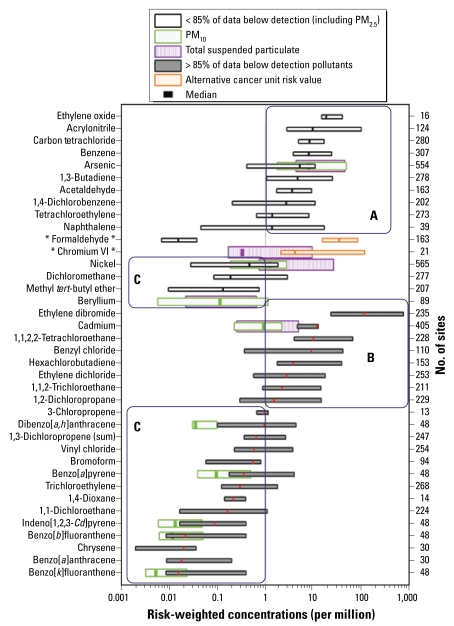
Figure 2.
National distributions of cancer risk–weighted concentrations. Each bar shows the 5th to 95th percentile risk-weighted concentration range for a given pollutant. The lines in the middle of the bars denote median concentrations. Overlapping bars for PM metals display the three size fractions. Concentrations are weighted by the U.S. EPA OAQPS-recommended chronic unit risk estimates. For descriptions of the lettered boxes surrounding the groups of pollutants, see “Results.” Pollutants with alternative unit risk estimates described in the text are listed with asterisks around their names.

