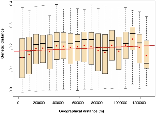
Figure 5. Comparison of genetic and geographical distances as assessed by the Mantel test.
In each box plot, the red dot represents the genetic distance average, and the black bar the median value. The upper extremity of the box represents the third quartile, and the lower the first quartile. The dotted lines show ranges between upper and lower extreme genetic values. Upper bars represent the ninth decile, and the lower the first decile. The red line represents the regression line. Number of pairwise comparisons per class box plot from left to right: 1, 14,333; 2, 5,519; 3, 13,120; 4, 13,986; 5, 8,497; 6, 17,878; 7, 10,419; 8, 12,273; 9, 12,231; 10, 11,149; 11, 11,562; 12, 6,036; 13, 4,954; 14, 5,359; 15, 6,165; 16, 7,976; 17, 4,296; 18, 2,163; 19, 5,250.

