Figure 2.
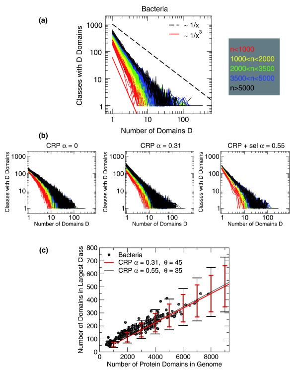
Internal usage of domains. (a) Histograms of domain usage; empirical data for 327 bacteria. The x-axis indicates the population of a domain class, and the y-axis reports the number of classes having a given population of domains. Each of the 327 curves is a histogram referring to a different genome. The genome sizes are color-coded as indicated by the legend on the right. Larger genomes (black) tend to have a slower decay, or a larger cutoff, compared to smaller genomes (red). The continuous (red) and dashed (black) lines indicate a decay exponent of 3 and 1, respectively. (b) Histograms of domain usage for 50 realizations of the model at genome sizes between 500 and 8,000. The color code is the same as in (a). All data are in qualitative agreement with the empirical data. However, data at α = 0 appear to have a faster decay compared to the empirical data. This is also evident looking at the cumulative distributions (section A1 in Additional data file 1). The right panel refers to the model with specificity, at parameter values that reproduce well the empirical number of domain classes at a given genome size (Figure 1). (c) Population of the maximally populated domain class as a function of genome size. Empirical data of prokaryotes (green circles) are compared to realizations of the CRP, for two different values of α. The lines indicate averages over 500 realizations, with error bars indicating standard deviation. α = 0 can reproduce the empirical trend only qualitatively (not shown). Data from the SUPERFAMILY database [19].

