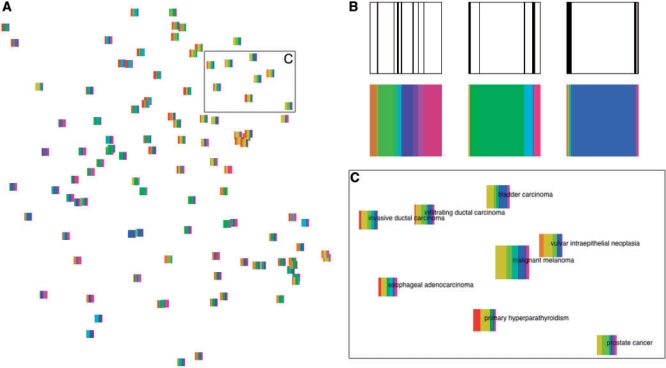
Fig. 2.
The experiment collection visualized as glyphs on a plane. Topic colors in all glyphs match topic colors in Figure 1. (A) NeRV projection of the 105 experiments, each shown as a glyph. (B) The slices of each glyph show the distribution of topics in the experiment. The experiment labels are from left to right: asthma, Barrett's esophagus and high-stage neuroblastoma. (C) Enlarged region from (A) where glyphs have additionally been scaled according to their relevance to the query with the ‘malignant melanoma’ experiment shown in the center. A detailed description of this experiment is included in Section 3.

