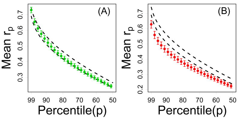
Figure 7.
Non-local connectivity of CR-regulated genes (Treatment series). In each plot, the vertical axis represents the average pth correlation percentile (among n genes) and the horizontal axis corresponds to p. For a given gene, correlations with all other transcripts on the Affymetrix Mouse Genome 430 2.0 array were determined, and the pth correlation percentile is the correlation value that is larger than p percent of all of these correlations. Genes that have strong “distant” connections (beyond immediately neighboring transcripts) should have large correlation percentiles, where the decay with increasing p indicates the decline in connection strength to increasingly distant network neighbors. In part (A), green points represent the average pth correlation percentile among the n = 12 CR-downregulated genes. In part (B), red points represent the average pth correlation percentile among the n = 16 CR-upregulated genes. In both (A) and (B), dashed black lines outline a 95% confidence region for the average pth correlation percentile among n genes sampled at random (based upon simulation). In 95% of 10,000 simulation trials, random samples of n genes from the Affymetrix Mouse 430 2.0 array yielded an average pth correlation percentile within the dashed lines. Results shown were generated from the Treatment series, but similar results were obtained based on the Tissue, Developmental and Mutation series (see Supplemental Data File 6).

