Figure 4.
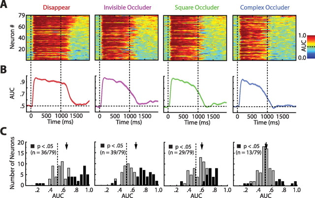
Analysis of encoding and delay period AUCs. A, AUCs of individual neurons sorted by condition. The plots show the AUCs for all neurons (ordinate) as a function of time (abscissa) and condition (panel). AUC values are color coded, with hotter colors illustrating values closer to 1.0. For every condition independently, we have sorted the neurons in descending order of delay period AUCs (as computed in C). Note, by inspecting the top parts of the panels, that every condition had a subpopulation of neurons that exhibited stimulus-selective responses during the delay. B, Population averaged AUCs. Each curve depicts the sliding window AUCs averaged across the entire population of neurons for one condition. Shaded regions indicate ±1 SEM. The two vertical dotted lines in A and B indicate sample and delay onset, respectively. C, Population histograms of delay period AUCs. The AUC values were computed from the entire last 750 ms of the delay period. The black bars indicate individual cells that were significant at the α = 0.05 level (Mann–Whitney U test). The arrows denote the population means of the distributions. Notice that the population means for the three simpler conditions were all significantly above 0.50 (p < 0.0001 in all cases). Although the complex occluder condition did not have a population mean significantly different from 0.50, 10 individual cells (of 79) did have significantly increased responses to the effective stimulus, more than expected by chance (binomial test, p < 0.006).

