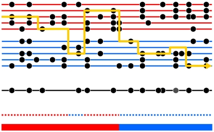
Figure 1. Schematic of the Markov model we use for ancestry inference.
The black lower line represents a chromosomal segment from an admixed individual, carrying a number of typed mutations (black circles). The underlying ancestry is shown in the bottom color bar, and reveals an ancestry change from the first population (red) to the second population (blue). The admixed chromosome is modeled as a mosaic of segments of DNA from two sets of individuals drawn from different reference populations (red and blue horizontal lines respectively) closely related to the progenitor populations for the admixture event. The yellow line shows how the admixed chromosome is constructed in terms of this mosaic. The dotted line above the bottom color bar shows the reference population being copied from along the chromosome – note that at most positions, this is identical to the true underlying ancestry, but with occasional “miscopying” from the other population (blue dotted segment occurring within red ancestry segment). Note also that switches between chromosomes being copied from, representing historical recombinations, are rapid (6 switches), while ancestry changes, representing recombination since admixture, are much rarer (1 switch). Finally, note that at most positions the type of the admixed chromosome is identical to that of the chromosome being copied from, but an exception to this occurs at one site, shown as a grey circle, and representing mutation or genotyping error. In our inference framework, we observe only the variation data for the admixed and reference individuals: the yellow line, and the underlying ancestry, must be inferred as the hidden states in a HMM.

