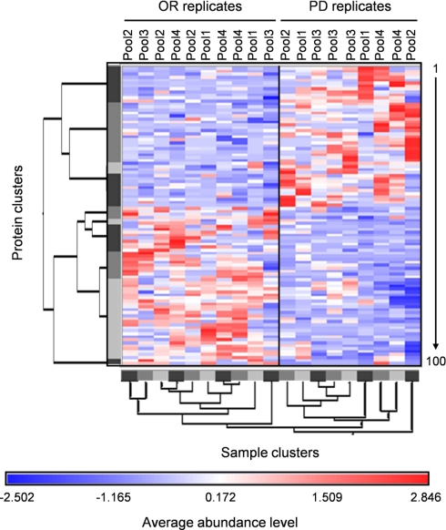
Fig. 4.
Hierarchical clustering of OR and PD samples. Red and blue colors indicate relative high and low protein abundance, respectively, and white equals median abundance. Gray bars represent sample and protein clusters. The length of the tree arms is inversely correlated with similarity. Proteins are listed vertically from top to bottom and numbered from 1 to 100 in the same order as in Table II.

