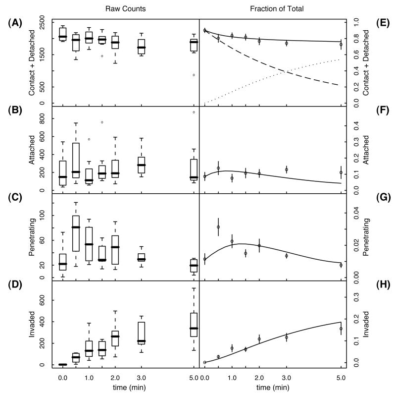
Figure 3.
The left hand column (A-D) shows box plots of the raw counts for each of the four observable classes of parasites. The median, 1st and 3rd quartiles, and the range of the data over all eight replicates is shown for each time point and each class. Outlier counts are indicated as open circles. The right hand column (E-H) shows the normalized mean number of counts and the error in the mean. Solid curves are the solution to the model using the parameters in Table 1 (realistic initial state). The solid curve in (E) is the predicted fraction of parasites washed away, i.e., the fraction of parasites in the combined contact and detached stages. The dashed curve is the fraction of parasites in the contact stage, while the dotted curve is the fraction of parasites in the detached stage.

