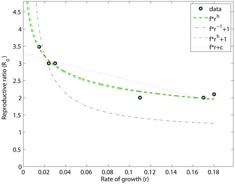
Figure 1. Relationships between the empirical parameters  and
and  .
.
The reproductive ratio is plotted against the rate of growth. The downward trend is not well described by the linear model with negative angular coefficient ( ) and an intercept (
 ) (dotted blue line). In addition, the model prediction with
  fixed (dashed-dot black line) fails to precisely represent the data, even if it provides a more reasonable relationship (notice that high stable prions, such as MK4985, would always be associated to positive
  values). Introducing one more degree of freedom (exponent
  ) yields a higher
  value (red line,
  ). This result corresponds to a prediction of
  . In addition, we tested a further simplified model version (where
  is considered to be much smaller than
  ) according to which
  (i.e.
(i.e.  , shown in green). Similar conclusions could be drawn.

