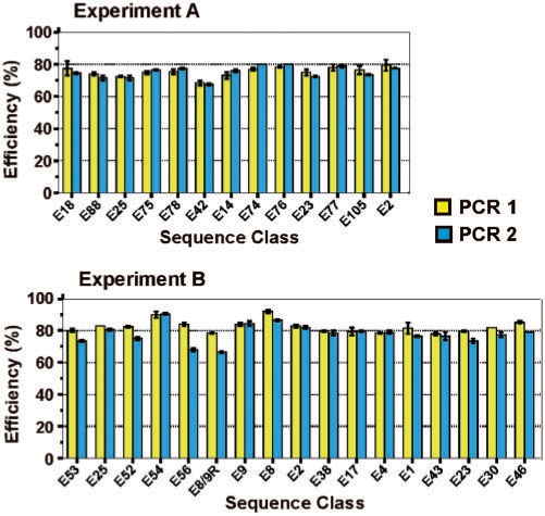
Figure 8.
PCR amplification efficiency. Each value represents the average of two duplicate experiments, and error bars correspond to the range. The efficiency of both PCR 1 (yellow bars) and PCR 2 (blue bars) are shown. The sequence classes are arranged in the same relative order (from left to right) as they appear in the fitness landscapes of Figures 4 and 5. The forward primer differs between PCR 1 and PCR 2, while the reverse primer differs between Experiments A and B. A representative sample of sequence classes are shown for experiments A and B.

