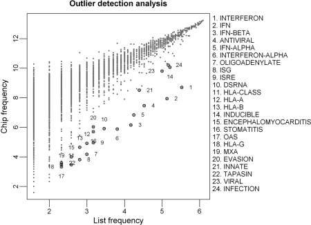
Figure 2.
A scatter plot of Chip versus List frequencies for tokens in the ISG gene list. Each data point represents an abstract term. Terms that were identified as significantly enriched (i.e. Bonferroni P ≤ 0.05) in the ISG gene list by using the Outlier method are circled and the adjacent numbers corresponding to their rankings. Chip (y-axis) represents the number of genes associated with each term on the whole chip. List (x-axis) represents the number of genes associated with each term in the ISG gene list. The log 2-transformed List and Chip frequencies are plotted.

