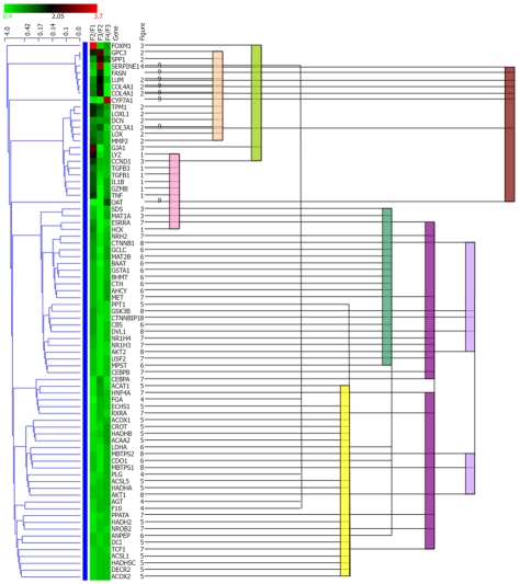
Figure 2.
Comparison between statistical clustering analysis and functional cluster. All genes in Figure 1 were subjected to hierarchical clustering analysis using Genowiz™. Statistical clustering of the expression ratio between neighboring F stages for the genes in Table 1 was combined with functional categories. The color coding in the center column shows the expression ratio between neighboring F stages for the genes in Table 1: Ratio increases from green to red. The left dendrogram shows the result of hierarchical clustering by Genowiz™ software. The numbers on the right of gene names indicate the subgraph numer in Figure 1, which represents functional categories, and the same numbers are tied with color bars.

