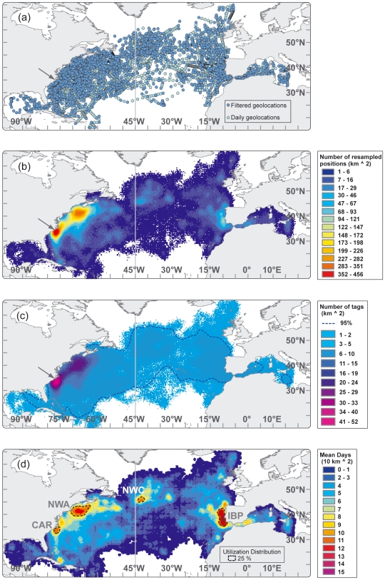
Figure 3. Maps showing calculation of utilization distribution from pooled geolocation tracks.
Dark grey line at 45° meridian indicates management line. (a) Blue circles are all deployment, daily geolocation and recapture positions (n = 7,793) from 106 bluefin tuna between 1996–2006 and light blue circles indicate daily, linearly interpolated positions (n = 14,716) (b) Kernel density grid of resampled daily positions (n = 1,471,600). (c) Grid of number of bluefin tuna tracked per square kilometer. Blue line outlines area of ≥3 tags. (d) Normalized kernel density grid of number of daily geolocations weighted by number of fish tracked per unit area. Black, dotted line outlines 25% utilization distributions, showing four regions of high residency throughout the North Atlantic.

