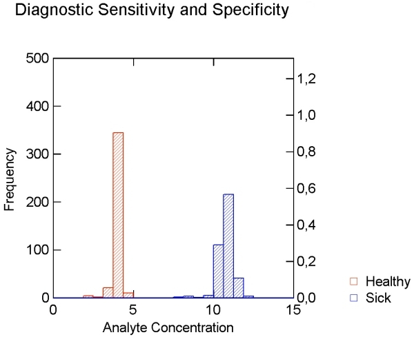
Figure 4. Data for setting diagnostic sensitivity and specificity as histograms .

Figure 4 shows the ideal situation where healthy (red) and sick (blue) patients are clearly separated from each other. The abscissa shows the analyte concentration, the left ordinate the frequency in each column. The right ordinate shows the relative frequency distribution (Value: 0=0%; 1=100%).
