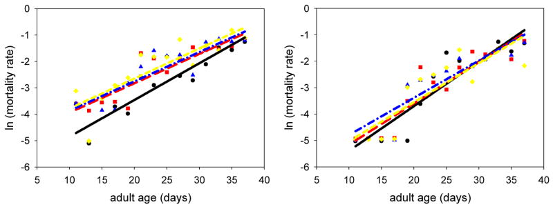
Fig. 2.
Results of experiment 1. The graph on the left depicts the mortality data for the males in experiment 1. The background mortality of the half-leg treatment ( ; line: red, long dash; p=0.0010), the whole-leg treatment (
 ; line: blue, dash-dot; p=0.0022), and the leg-tips treatment (
 ; line: yellow, short dash; p=0.0239) were all significantly higher than that of the controls (●; line: black, solid). The graph on the right depicts the mortality data for the females from experiment 1. Neither the background mortality nor the mortality rate was significantly different from the controls (all p-values > 0.05). The y-intercept in each of the mortality curves represents the background mortality, and the slope portrays the natural rate of aging.

