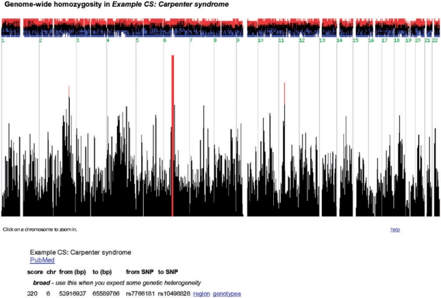
Figure 1.
Genome-wide homozygosity. This screen shots show the genome-wide homozygosity scores produced by HomozygosityMapper. These are plotted as a bar chart with red bars indicating the most promising genomic regions. Clicking on a bar will zoom into the chromosome harbouring the score. Above the bar chart, the excess or shortage of homozygous genotypes in cases versus controls is depicted. Below the figure, direct links to the most interesting regions are given. All figures depict the Carpenter syndrome study (31).

