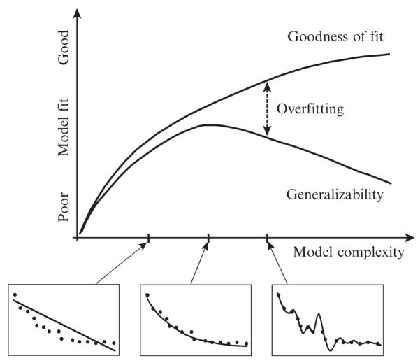
Figure 11.1.
An illustration of the relationship between goodness of fit and generalizability as a function of model complexity. The y axis represents any fit index, where a larger value indicates a better fit (e.g., maximum likelihood). The three smaller graphs provide a concrete example of how fit improves as complexity increases. In the left graph, the model (line) is not complex enough to match the complexity of data (dots). The two are well matched in complexity in the middle graph, which is why this occurs at the peak of the generalizability function. In the right graph, the model is more complex than data, capturing microvariation due to random error. Reprinted from Pitt and Myung (2002).

