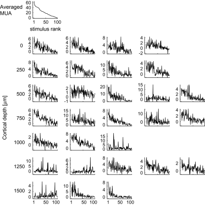
Figure 17.
Tuning curves of the individual cells in a representative spot and the tuning curve of averaged MUs of the spot. The graph at the left upper corner represents the tuning curve of averaged MUs and the rests represent tuning curves of single cells at different depths. Depth of cells in each row is indicated at the left. Horizontal axes are rank ordered according to the magnitude of evoked responses of averaged MUs to the 100 object stimuli in descending order. Vertical axes represent mean firing rate (spikes/s).

