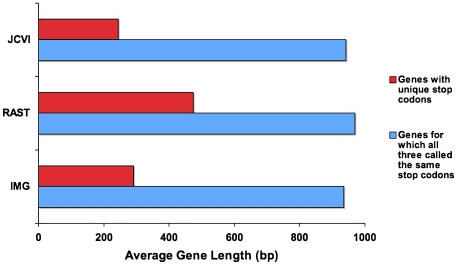
Figure 5. Comparison of average gene length.
Illustrates average gene length for two categories. Red bars represent the average length of genes from each annotation that have distinct stop codons. Blue bars represent the average length of genes that have a common stop codon across the three annotations.

