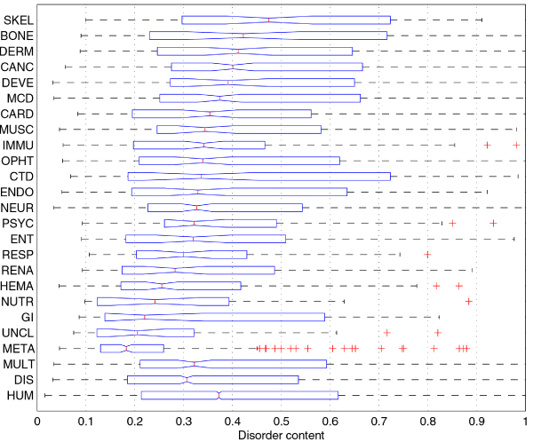
Figure 1.

Comparison of disorder content distributions in disease classes and human gene class using boxplots. The 22 disease classes are sorted according to their disorder content medians. The boxes in the boxplot represent the first quartile (left edge), median (line in the middle), and third quartile (right edge); the whiskers extend to the lowest/highest values within the 1.5 IQR interval from the box (IQR is the range between the first and the third quartile), while the + signs represent the outliers. Medians for two classes can be compared by looking at the notches at their median lines; if the notches do not overlap, the medians are different at the significance level α = 0.05.
