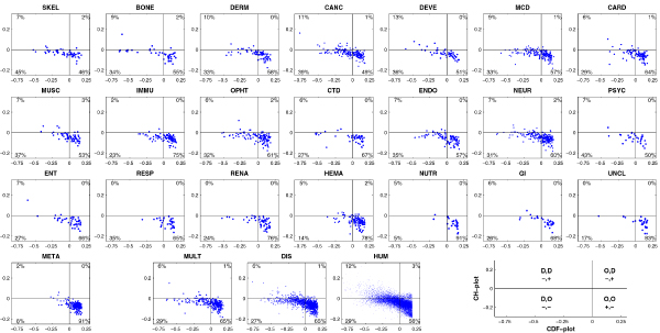
Figure 15.

Comparison of CDF and CH predictions in various disease gene classes and gene sets. Each spot represents a gene whose coordinates were calculated as the distance of the corresponding point in the CH-plot from the boundary (x-coordinate) and the averaged distance of the corresponding CDF-curve from the CDF boundary (y-coordinate). Four quadrants in each plot correspond to the following predictions: (-,-) proteins predicted to be disordered by CDF, but compact by CH, (-,+) proteins predicted to be disordered by both methods, (+,-) ordered proteins, (+,+) proteins predicted to be disordered by CH, but ordered by CDF. This is further illustrated by an explanatory plot at the bottom right corner. Percentages represent the fractions of genes in the corresponding quadrants.
