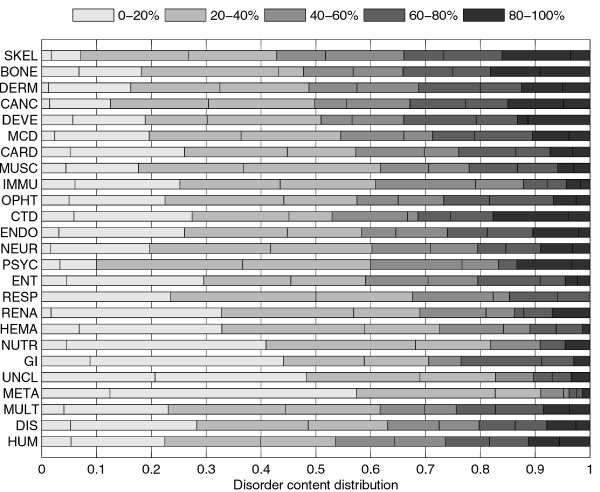
Figure 2.

Comparison of disorder content distributions in disease classes and human gene class using stacked histograms. The histograms are stacked horizontally to save space. They show what fraction of genes in each class has disorder content within various ranges. Each of the five major ranges, that cover 20% each, is further split into two smaller 10% ranges (they use the same color, but are divided with a line). Distributions can be visually compared by observing the balance between darker and lighter shades of gray; the class with a darker histogram has on average more disorder content.
